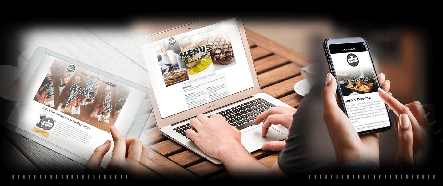
New Garry’s, Same Delicious Food
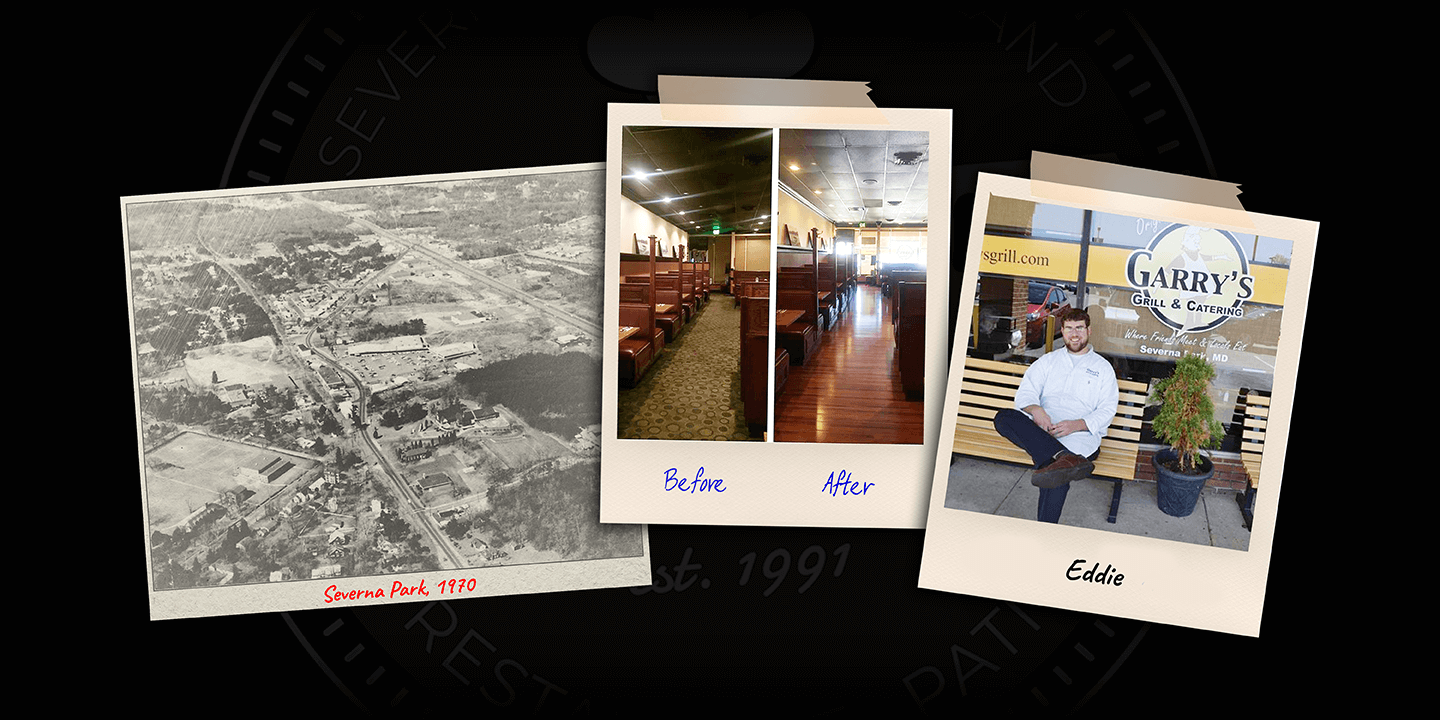
Garry’s, located in Severna Park, Maryland, opened its doors to the community in 1991. The local restaurant originally started as Garry’s Grill & Catering. And while they are the same company they have always been, some significant changes have occurred over the last 3 decades. For starters, about 10 years ago, Eddie, the bus-boy that became the manager, took over the company from his previous mentor, Garry. In an ode to him, Eddie never changed the name of the restaurant. However, with some new renovations to the interior and online, Garry’s has grown exponentially. Nevertheless, you can still find the same family-friendly atmosphere and amazing food.


Creating a New Logo
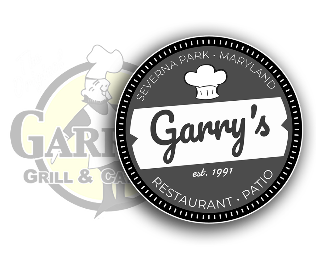
Color Fire had been working on the previous branding of Garry’s for some time when renovations for the dining room started. Because of this, and the slightly updated look, we thought it would be a great opportunity to also update the website and brand. In fact, the most important aspect was the logo. While we desired a more modern and simple logo, the owner still wished to pay respect to the original. For that reason, the same round shape was kept, along with including the chef’s hats. It was also important to show not only how long Garry’s had been around but how proud they were to be apart of the Severna Park community for so long. As a result, the new logo was born.

Garry’s Explains it All – Read Our Blog
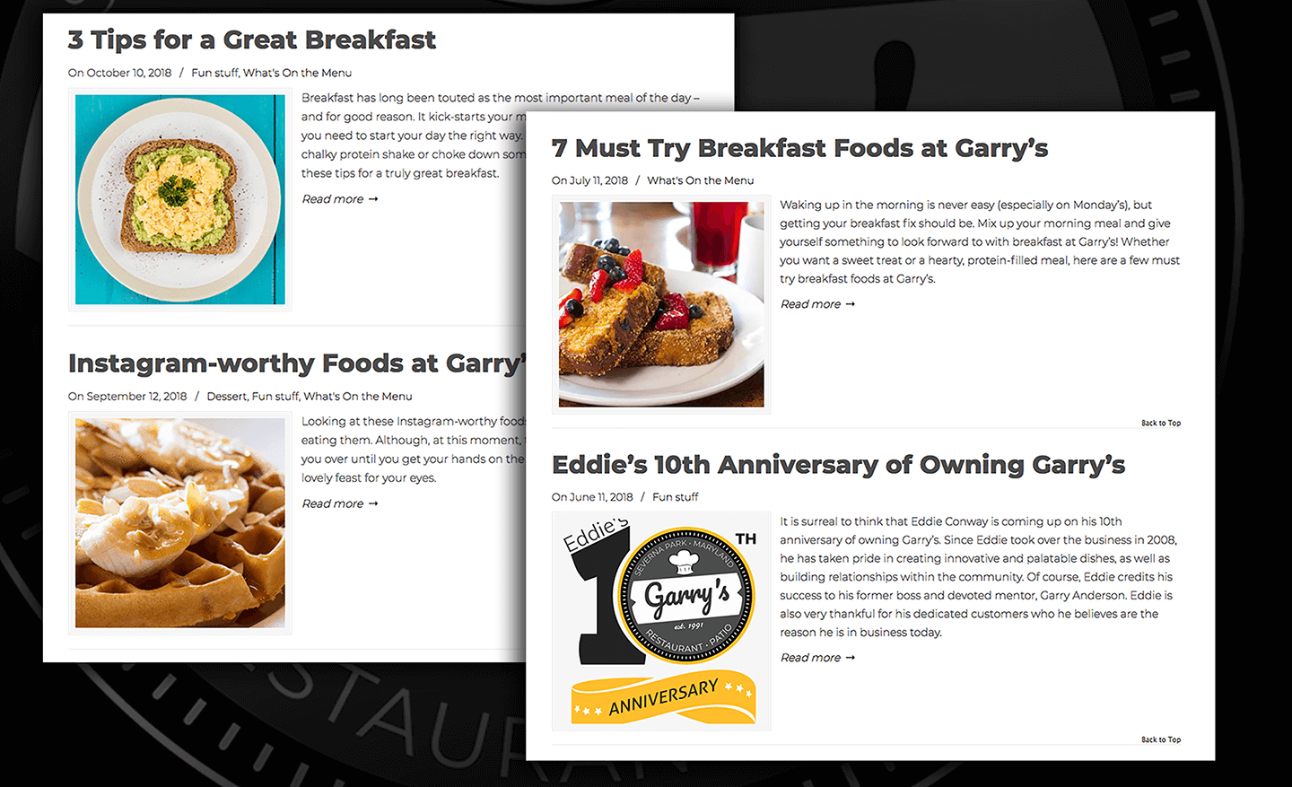
Branding isn’t the only thing Color Fire does for Garry’s. We work in partnership with their team to come up with quality, captivating, and engaging content for their blog. From articles that will make you laugh to employee highlights and great recipes to try at home, we work hard to capture the essence of Garry’s. And it’s a hit. The blog accounts for around 15-20% of annual traffic to Garry’s website. Some blogs even outpace the main menus in yearly traffic. That is saying something!

A New Look… A New Social Media Presence
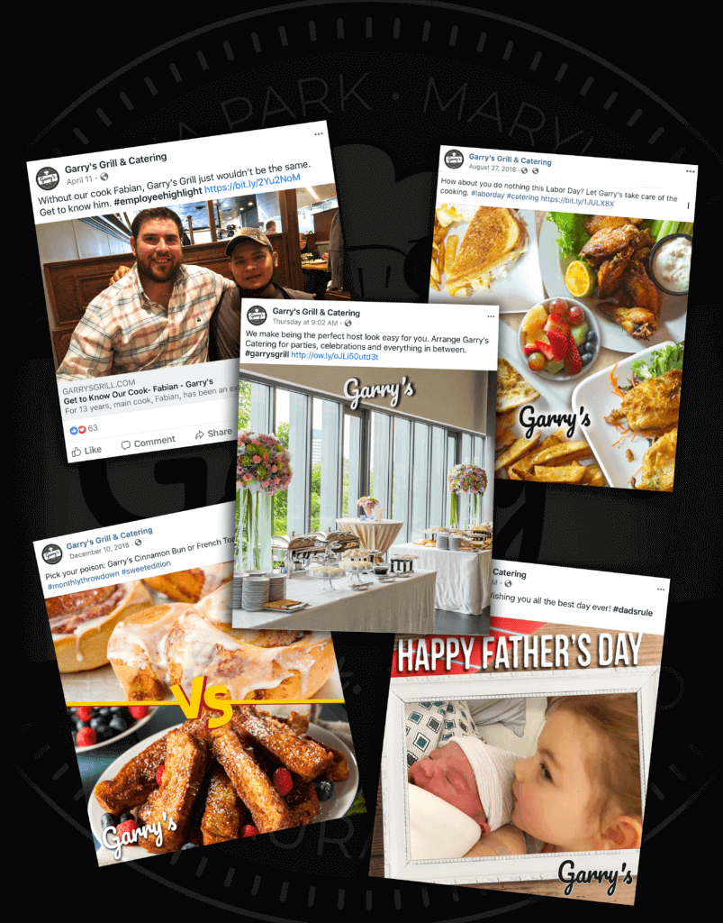
When rebranding, it’s not just the logo you have to consider. It’s important to rework all creative, and for Garry’s, this meant social media posts. As part of the old branding, red and yellow colors were commonly used to signify Garry’s brand on Facebook. And while we wanted to start using the new logo, we didn’t want customers to struggle in recognizing the new brand. Thus, we created a second logo that just reads ‘Garry’s’. This not only solved the logo’s readability in smaller images it also allowed customers to ease into the new look. We also did away with the cartoons, featured in the previous logo, and used more lifestyle images to capture the current essence of Garry’s. This has helped increase social engagement overall. Check them out on Facebook!
Moving Forward Online
Last, but certainly not least, the rebranding allowed us to perform a major update of the entire website. While we had been apart of the previous website redesign, this allowed up to recreate the new look, apply better layouts, and use analytics to determine user experience. Combined, these efforts allowed us to design a better website overall. With big visuals, responsive design, and easy-to-find navigation, we saw website traffic increase and bounce rates decrease. Moreover, it was important to infuse the original look, so the main homepage image still has the original logo. If you are interested in learning more about this rebranding or rebranding your company, contact Color Fire today.
